
Responsive Design Best Practices: Ensuring Your Site Looks Great on Any Device
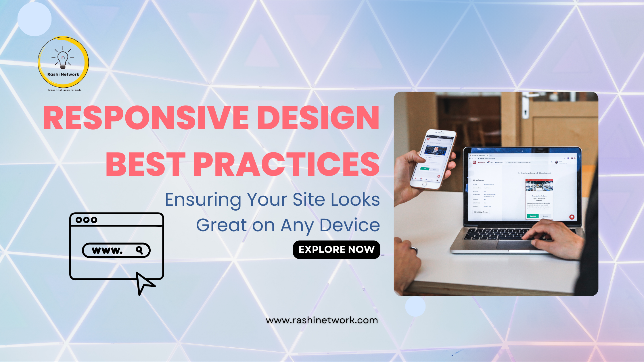
Responsive design is essential for any website today because users access sites from various devices, including smartphones, tablets, and desktops. A responsive website adjusts its layout and content based on the screen size, ensuring a good user experience no matter what device is used. Here are some best practices to help you create a responsive website that looks great and works well for everyone.
What is Responsive Design?
Responsive design allows your website to adapt to different screen sizes. This means that whether someone is using a phone, tablet, or computer, they will see a version of your site that fits their device perfectly. Key elements of responsive design include flexible layouts, fluid images, and media queries.
Best Practices for Responsive Design
- Start with Mobile First Focus on designing for mobile devices before scaling up to larger screens. This approach helps you prioritize the most important content and features for smaller displays. Once you have a solid mobile design, you can expand it to work well on tablets and desktops.
- Use Fluid Grids Instead of fixed pixel sizes, use fluid grids that rely on percentages. This allows your layout to resize naturally based on the screen size. For example, a three-column layout on a desktop can stack into a single column on mobile without losing functionality.
- Incorporate Media Queries Media queries let you apply different styles based on the device’s screen size. Common breakpoints include:
- Optimize Images Large images can slow down your site, especially on mobile devices. Use scalable vector graphics (SVGs) when possible because they look sharp at any size. Additionally, use the srcset attribute in HTML to serve different image sizes based on the device’s resolution.
- Design for Touch Many users interact with websites using touch screens. Make sure buttons and links are large enough to tap easily—aim for at least 44x44 pixels for touch targets.
- Prioritize Content Space is limited on smaller screens, so highlight the most important content while hiding or collapsing less critical elements. This keeps users focused on what matters most.
- Test Across Devices Regularly test your website on various devices and screen sizes to ensure everything works as it should. While emulators can help simulate different environments, testing on real devices gives the best results.
- Use Conditional Loading Conditional loading means only loading resources when they are needed or visible on the screen. This improves performance, especially for mobile users with limited bandwidth.
- Consider Landscape Orientation Many users view websites in landscape mode on their mobile devices. Ensure your design looks good in both portrait and landscape orientations by testing how layouts adapt in each view.
- Maintain Accessibility Standards Make sure your responsive design meets accessibility standards so all users can navigate your site easily. Use high-contrast colors for text and backgrounds, provide alt text for images, and ensure that keyboard navigation is possible.
Conclusion
Creating a responsive website is crucial in today’s multi-device environment. By following these best practices—starting with mobile first, using fluid grids and media queries, optimizing images, and prioritizing content—you can build a site that provides an excellent user experience across all devices.
At Rashi Network, we specialize in developing responsive web designs that engage users effectively. If you need help making your website more responsive or want to enhance its overall design, contact us today! Let us assist you in creating a website that looks great no matter where it’s viewed!